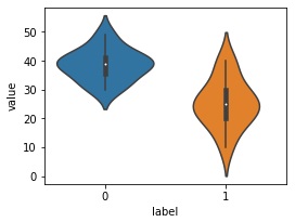
plt.figure(figsize=(4,3))
sns.violinplot(x='label', y='value',data=df)

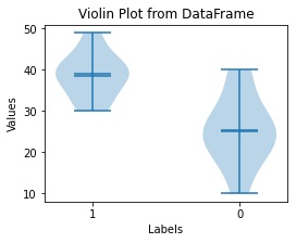
# データをラベルごとにグループ化
grouped_data = [group['value'].values for name, group in df.groupby('label')]

# バイオリンプロットの描画
fig, ax = plt.subplots(figsize=(4,3))
ax.violinplot(grouped_data, showmeans=True, showmedians=True)

# ラベルの設定
ax.set_xticks(range(1, len(df['label'].unique()) + 1))
ax.set_xticklabels(df['label'].unique())
ax.set_xlabel('Labels')
ax.set_ylabel('Values')
ax.set_title('Violin Plot from DataFrame')
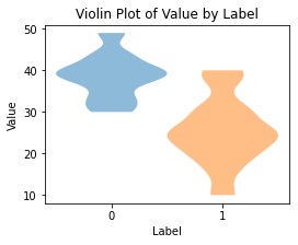
from scipy.stats import gaussian_kde

def violin_plot(ax, data, positions, width=0.5):
    for i, pos in enumerate(positions):
        d = data[i]
        kde = gaussian_kde(d, bw_method=0.3)
        x = np.linspace(min(d), max(d), 100)
        v = kde.evaluate(x)
        v = v / v.max() * width
        ax.fill_betweenx(x, pos - v, pos + v, alpha=0.5)

fig, ax = plt.subplots(figsize=(4,3))

# データをラベルごとに分ける
data_0 = df[df['label'] == 0]['value']
data_1 = df[df['label'] == 1]['value']

# 描画
violin_plot(ax, [data_0, data_1], positions=[0, 1])

ax.set_xticks([0, 1])
ax.set_xticklabels(['0', '1'])
ax.set_xlabel('Label')
ax.set_ylabel('Value')
ax.set_title('Violin Plot of Value by Label')